Responsive Website Design: Building Websites That Work Everywhere
In today’s fast-paced digital world, having a website is no longer enough. Businesses need websites that provide a smooth, engaging, and consistent experience across every device. With users accessing websites through smartphones, tablets, laptops, and desktop computers, responsive website design has become an essential part of a successful digital strategy. A responsive website automatically adjusts its layout, images, content, navigation, and other elements according to the visitor’s screen size, ensuring that the website looks professional and functions properly on every device.
What Is Responsive Website Design?
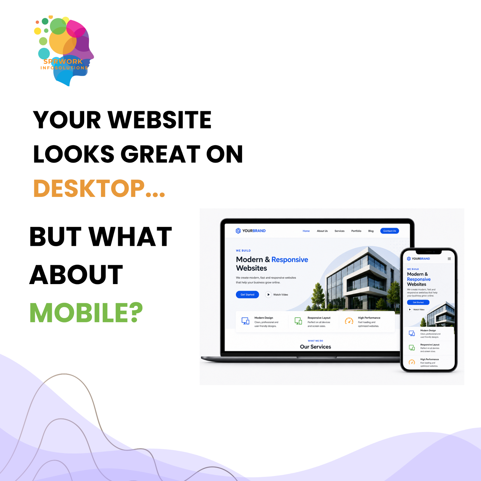
Responsive website design is an approach to web development that allows a website to adapt seamlessly to different screen sizes and resolutions. Instead of creating separate websites for desktop and mobile users, responsive design uses flexible layouts, images, grids, and design elements to provide a consistent experience across multiple devices.
For example, a website that looks well-organized on a large desktop screen should also be easy to navigate on a smartphone. Text should remain readable, buttons should be easy to click, images should fit properly, and important information should remain accessible without unnecessary zooming or horizontal scrolling. Responsive design makes this possible while maintaining the overall look, functionality, and brand identity of the website.
Why Is Responsive Design Important for Businesses?
A website is often the first point of interaction between a business and its potential customers. If visitors find a website difficult to use on their mobile devices, they may leave quickly and look for an alternative. A responsive website helps businesses create a positive first impression while making it easier for users to explore products, services, and information.
Mobile-friendly design also improves the overall user experience. Visitors can easily browse pages, read content, fill out forms, make inquiries, and interact with different website elements regardless of the device they are using. A better user experience can lead to higher engagement, longer visits, and more opportunities for conversions.
Responsive design can also support search engine optimization. Search engines consider mobile usability as an important factor when evaluating websites. A website that performs well across different devices can provide a better experience for users and support a stronger online presence.
Key Benefits of Responsive Website Design
A responsive website offers several advantages for modern businesses. It provides a consistent brand experience across devices, improves usability, supports mobile visitors, and reduces the need to maintain separate desktop and mobile versions of a website.
Responsive design can also help improve website performance when implemented correctly. Optimized images, flexible layouts, clean code, and efficient design practices can contribute to faster loading and smoother browsing experiences. This is particularly important because users expect websites to load quickly and respond smoothly.
Another important benefit is scalability. As new devices and screen sizes continue to appear, a properly developed responsive website can adapt more easily without requiring a complete redesign. This makes responsive design a practical long-term investment for businesses looking to grow their digital presence.
Responsive Design Is More Than Just Mobile-Friendly
It is important to understand that responsive website design is not simply about making a desktop website smaller. It involves carefully planning how content, navigation, images, buttons, forms, and other components behave across different screen sizes.
A professional responsive website considers the complete user journey. From the moment visitors land on a page to the moment they contact the business or complete an action, every element should be designed with usability and accessibility in mind. The goal is to create an experience that feels natural, intuitive, and professional regardless of how users access the website.
Why Choose SPRWork Infosolutions?
At SPRWork Infosolutions, we understand that a website should be more than just visually attractive. It should support your business goals, communicate your brand effectively, provide an excellent user experience, and work seamlessly across different devices.
Our approach to responsive website design focuses on combining modern aesthetics, functionality, performance, usability, and business objectives. We create websites that are designed to adapt across desktops, tablets, and smartphones while maintaining a consistent and professional brand experience.
From understanding your business requirements and planning the website structure to designing user-friendly interfaces and developing responsive layouts, our team focuses on every stage of the process. We aim to create digital experiences that are easy to navigate, engaging for visitors, and aligned with your business objectives.
Whether you are launching a new business website, redesigning an existing website, or looking to improve your current online presence, SPRWork Infosolutions can help you build a responsive and professional digital platform that is ready for today’s multi-device audience.
Your customers are browsing from different screens. Is your website ready for all of them?
Connect with SPRWork Infosolutions today and let’s create a responsive website that delivers a seamless experience and helps your business grow online.

 Previous Post